Breadcrumb separators belong in CSS, not HTML. Using ::after pseudo-elements keeps your markup semantic and makes separators trivial to change globally.
<nav aria-label="Breadcrumb"> <ol> <li><a href="/">Home</a></li> <li><a href="/products">Products</a></li> <li><a href="/products/widgets">Widgets</a></li> </ol></nav>nav > ol { display: flex;} nav > ol > li:not(:last-child)::after { content: " / "; color: #9ca3af; padding: 0 0.5em;}The :not(:last-child) selector ensures no trailing separator after the final item.
Want different separators? Just change the content value:
/* Chevron */li:not(:last-child)::after { content: " › ";} /* Arrow */li:not(:last-child)::after { content: " → ";} /* Pipe */li:not(:last-child)::after { content: " | ";}For icon separators, use a background image instead:
li:not(:last-child)::after { content: ""; width: 1em; height: 1em; background: url("data:image/svg+xml,...") center / contain no-repeat;}This pattern works for any horizontal list needing separators—breadcrumbs, tag lists, or inline metadata.
The popover attribute and popovertarget give you dropdown menus with light-dismiss behavior—no JavaScript required.
<button type="button" popovertarget="dropdown-menu"> Options</button> <nav id="dropdown-menu" popover> <ul> <li><a href="/settings">Settings</a></li> <li><a href="/profile">Profile</a></li> <li><a href="/logout">Logout</a></li> </ul></nav>Click the button—the menu opens. Click outside or press Escape—the menu closes. That’s it.
What you get for free:
- Light dismiss — Clicking outside or pressing Escape closes the popover
- Top-layer rendering — Popovers render above all other content, no
z-indexbattles - Focus management — Focus moves into the popover and returns when closed
- No scroll lock — Unlike modal dialogs, the page remains scrollable
For breadcrumb navigation with dropdown switchers:
<li> <a href="/org/acme">Acme Corp</a> <button type="button" popovertarget="org-switcher">▾</button> <nav id="org-switcher" popover> <ul> <li><a href="/org/acme">Acme Corp ✓</a></li> <li><a href="/org/globex">Globex Inc</a></li> <li><a href="/org/new">+ New organization</a></li> </ul> </nav></li>Each breadcrumb segment can have its own popover for switching between items at that level—organizations, projects, environments—without any JavaScript toggle logic.
Combine with CSS anchor positioning and position fallbacks for pixel-perfect dropdown placement.
What happens when your anchored popover runs out of space? With position-try-fallbacks, the browser automatically tries alternative positions—no JavaScript resize observers needed.
[popover] { /* Primary position: bottom-right of anchor */ position-area: span-right bottom; /* If that doesn't fit, try these in order */ position-try-fallbacks: --bottom, --span-left-bottom;} @position-try --bottom { position-area: bottom;} @position-try --span-left-bottom { position-area: span-left bottom;}The position-area property positions the element relative to its anchor using a 3x3 grid. Values like span-right bottom mean “span the center and right columns, in the bottom row.”
When the primary position causes overflow, the browser tries each fallback in order until one fits. Define fallbacks with @position-try blocks.
Common position-area values:
bottom— Centered below the anchorspan-right bottom— Below, spanning center to rightspan-left bottom— Below, spanning left to centertop— Centered above the anchor
Built-in flip fallbacks also exist:
[popover] { position-area: bottom; /* Flip to top if bottom overflows */ position-try-fallbacks: flip-block;}This gives you the adaptive positioning of JavaScript libraries like Floating UI, but with zero JavaScript and better performance.
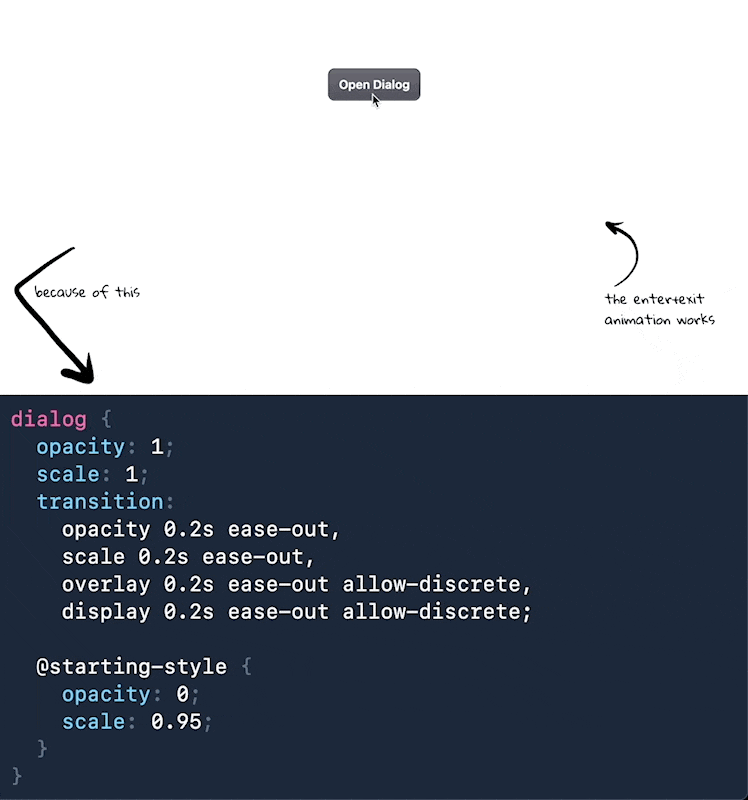
Enter animations are easy with @starting-style, but exit animations need transition-behavior: allow-discrete to work. Most CSS properties are continuous—opacity can be 0.5, colors can blend. But display is discrete: it’s either none or block, with no intermediate values.
The allow-discrete keyword tells the browser to apply transition timing even for discrete properties. For closing animations, the browser keeps the element visible, runs the exit transition, then flips to display: none only after the transition completes.
dialog { opacity: 1; scale: 1; transition: opacity 0.2s ease-out, scale 0.2s ease-out, overlay 0.2s ease-out allow-discrete, display 0.2s ease-out allow-discrete; @starting-style { opacity: 0; scale: 0.95; }} dialog:not([open]) { opacity: 0; scale: 0.95;}The overlay property controls whether the dialog stays in the top layer during the transition—without it, the dialog would immediately drop behind other content.
Don’t forget the backdrop:
dialog::backdrop { background-color: rgb(0 0 0 / 0.5); transition: background-color 0.2s ease-out, overlay 0.2s ease-out allow-discrete, display 0.2s ease-out allow-discrete; @starting-style { background-color: rgb(0 0 0 / 0); }} dialog:not([open])::backdrop { background-color: rgb(0 0 0 / 0);}Demo:
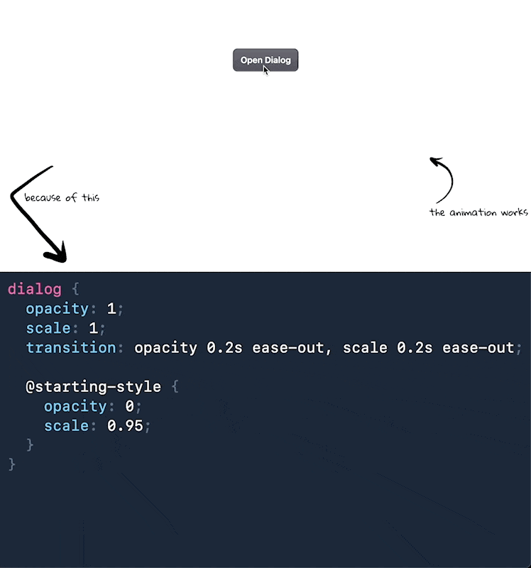
Want smooth fade-in animations when your <dialog> opens? The @starting-style CSS rule defines the initial state when an element first appears—no JavaScript needed.
dialog { opacity: 1; scale: 1; transition: opacity 0.2s ease-out, scale 0.2s ease-out; @starting-style { opacity: 0; scale: 0.95; }}Without @starting-style, the browser renders the dialog immediately in its final state. With it, the browser starts from opacity: 0; scale: 0.95 and transitions to opacity: 1; scale: 1.
You can animate the backdrop too:
dialog::backdrop { background-color: rgb(0 0 0 / 0.5); transition: background-color 0.2s ease-out; @starting-style { background-color: rgb(0 0 0 / 0); }}Demo: